Improving NRE mobile results page conversions by £1m
13th August 2018

National Rail Enquiries (NRE)


My Role & Objective
I was the lead UX designer in the project which included coming up with new designs to test against. I worked with a team of other UX researchers.
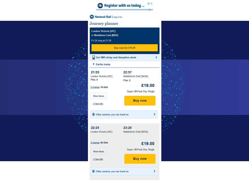
The Problem
We wanted to improve overall Buy Now and Hand-off rates by reducing screen real estate to show more journey options. At the moment, each journey takes a substantial amount of vertical real estate which can be reduced. The readability of journey times can also be improved at the same time. This will make it easier for visitors to select tickets to buy.
What did we test?
We stacked the train times horizontally and moved other information and the CTA into a more compact layout.
My Solution
The new layout increased Buy Now clicks by +3.2% and also produced a +15.0% increase in Hand-offs. These gains are estimated to produce an additional +£81,800 in revenue per month.
Results and observations
- The more compact layout significantly improved clicks on the Buy Now buttons and had an even stronger effect on Hand-off rates.
- Clicks also increased on all other elements on the Results Page with the new layout.
- Gains from the winning creative are estimated to produce over +2,000 more hand-offs/month, and an additional +£81,800 in revenue/month.
Buy Now Clicks
The condensed layout produced significantly higher engagement rates with the Buy Now CTA.
Hand-off Page
The new layout had an even greater positive effect on hand-offs.
Results Page Engagement
The challenger received more clicks on all other elements within the Results Page.